A nonprofit with a mission to capture the history of communities in the South.
We built the visual identity and pitch deck to help them tell that story to partners.
SERVICES
Logo Design, Pitch Deck Design, Impact Report
YEAR
2026

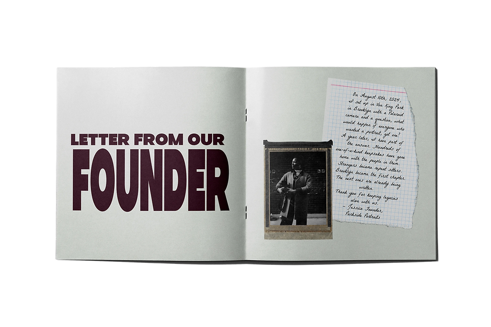
Parkside Portraits came to us with a mission that was bigger than their brand. They're a nonprofit dedicated to capturing and preserving the history of Black communities across the South through photography, pop-up photo booths, gallery exhibitions, and community events. But all they had to show for it visually was a Canva logo.
They needed two things fast: a visual identity that matched the seriousness of the work they were doing, and two pitch decks. One to introduce the organization to potential partners and funders, and another specifically to secure funding for Seeds of the South, an upcoming tour documenting communities across the region. The brand had to feel rooted, community-driven, and credible enough to sit in front of funders and institutional partners without flinching.
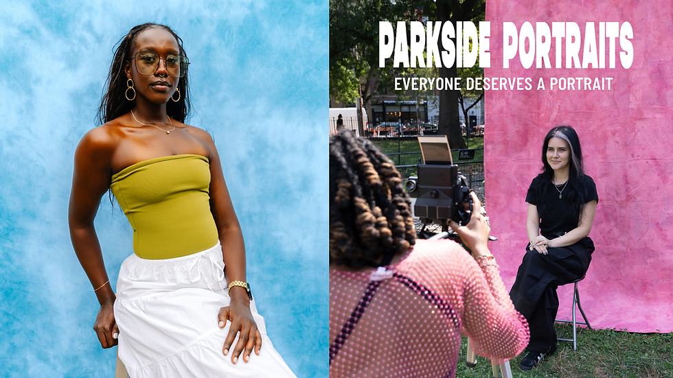


The colors pull from the communities Parkside documents and represents. Bold pops of color give it the energy it needs to show up on gallery walls, event signage, and social content. Nothing here feels corporate or manufactured, the palette was built to feel lived-in.

The logo system needed to feel bold enough to hold its own on gallery walls and event signage, but simple enough to work on a sticker at a pop-up photo booth. The primary wordmark with stacked type that carries the energy of a protest poster or community flyer.
A "P" monogram with a polaroid photo tucked inside the letterform. The polaroid is the quiet nod to what Parkside actually does: capture moments. Together the system gives Parkside a visual identity that feels grassroots and intentional, not corporate nonprofit.

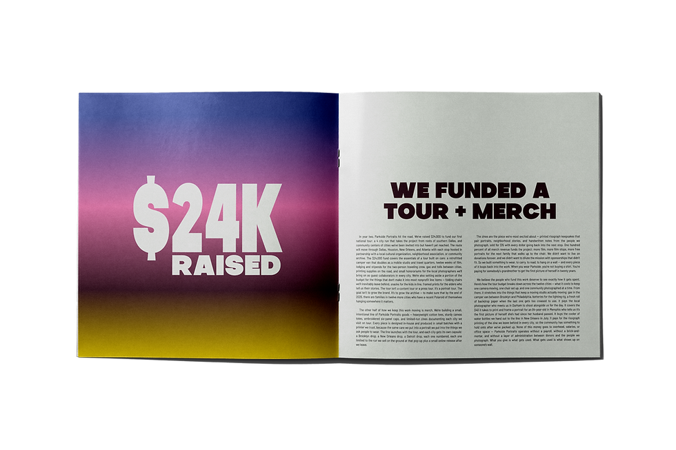
Built specifically to secure funding for Seeds of the South, a four-city tour documenting Black communities across Dallas, Houston, Atlanta, and New Orleans. The design language borrows from vintage protest posters and community bulletin boards. Including bold, stacked type, archival photography, and a color palette that feels urgent without being aggressive. Every slide was built to hold weight in a room full of funders while still feeling connected to the communities the work is about. The typography shifts between large-scale headlines and structured body copy to control pacing. Big statements hit first, details follow for the people who want to read deeper.

Parkside Portraits launched the brand at a gallery event in Dallas, TX, featuring printed signage, branded merchandise, a photo backdrop, and donation materials. All designed through the identity system we built. The brand went from a Canva logo to a full visual presence in a room full of community members, artists, and potential funders.