

A fitness nonprofit bringing fitness classes to underserved communities one rep at a time.
We wanted to build the brand identity to match the weight of the client.
SERVICES
Brand Identity, Social Design, Marketing Materials
YEAR
2025

The Visual Identity
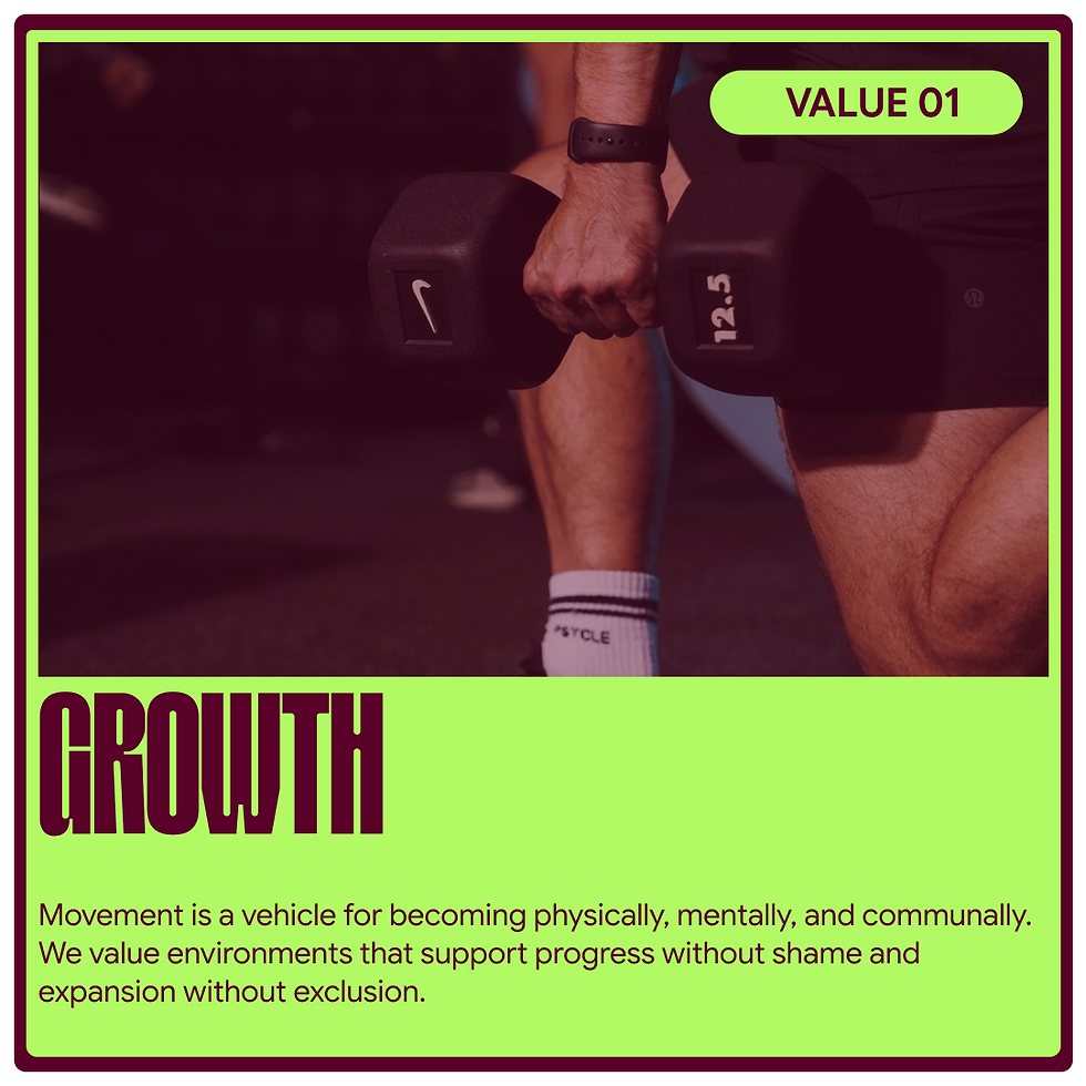
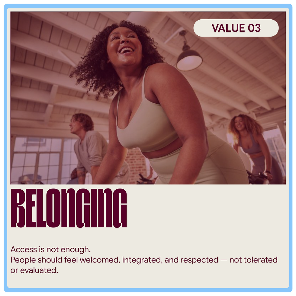
The brand system was built to feel as energetic as the communities it serves. The SEF monogram uses bold, compressed letterforms stacked tight. Designed to hit hard on a banner, a tee, or a gym wall. The full word mark carries that same density with a hand-crafted weight that feels physical, like the work itself.
The icon is two mirrored dumbbells connected by a single drop, representing sweat as the equalizer. Effort is the currency, and the mark makes that visual. The neon green against deep plum and sky blue gives the palette an edge that feels athletic and youthful without defaulting to the typical sports nonprofit look. "Effort. Access. Equity." anchors the whole system as both a brand tagline and a mission statement in three words.


Typography
The compressed, stacked typography carries physical weight being dense and bold, built to hold space on a gym wall, a banner, or a tee. The same way the foundation holds space for the people it serves. "Equity > Charity" isn't just a design choice, it's the whole philosophy.


User Class Pass
A sponsored class pass program for Sweat Equity Foundation. The Rep is a two-month physical card that grants cardholders two free classes per month at participating studios. The card was designed as a deliberate alternative to app-based booking systems, which quietly exclude the people most in need of access. Each card is printed with the cardholder's name,, and unique member ID, with a scannable code on the back for studio check-in. The system functions as both a usable membership artifact and a brand extension.


Social Media Design
We designed a social content system that could carry the brand's voice across Instagram without needing a new layout every post. The brand mark, icon, and photography all work together in a modular system. Bold type over black-and-white imagery for motivational posts, clean gradient backgrounds for brand awareness, and the SEF icon woven into photography as a graphic overlay. Every post reinforces the same message: this space is yours by being simple and reinforcing negative space into the design.




Location Flyer
A print piece designed to introduce Sweat Equity Foundation's network of participating studios to donators & community partners. The two-sided flyer pairs a bold cover headline with an editorial-style city map on the reverse, marking each partner studio with the foundation's signature sweat-drop pin. The piece was designed to live in places where the people SEF serves actually are: community centers, libraries, laundromats, transit stops, and front desks of partner studios themselves.

